WORKS
/ 001 /
Industry leading for Research Reporting

The global powerhouse for residential and commercial Real Estate consultancy, Knight Frank, commissioned us for three years running to produce an annual research report we titled Global Cities.
To produce this large publication where the content is easy to read, appealing to different audience types and provides beautiful, easy-to-understand data visualisations, we went to work on planning a publication that was visually interesting, with every page designed to pull you into the content and make you read and engage. Through the use of data visualisations, iconography, statistics, photography, illustrations and highly crafted typographic and layout treatments, we produced an industry-leading publication that is considered a cornerstone piece of industry research.
/ 002 /
A fresh new brand for architectural innovators
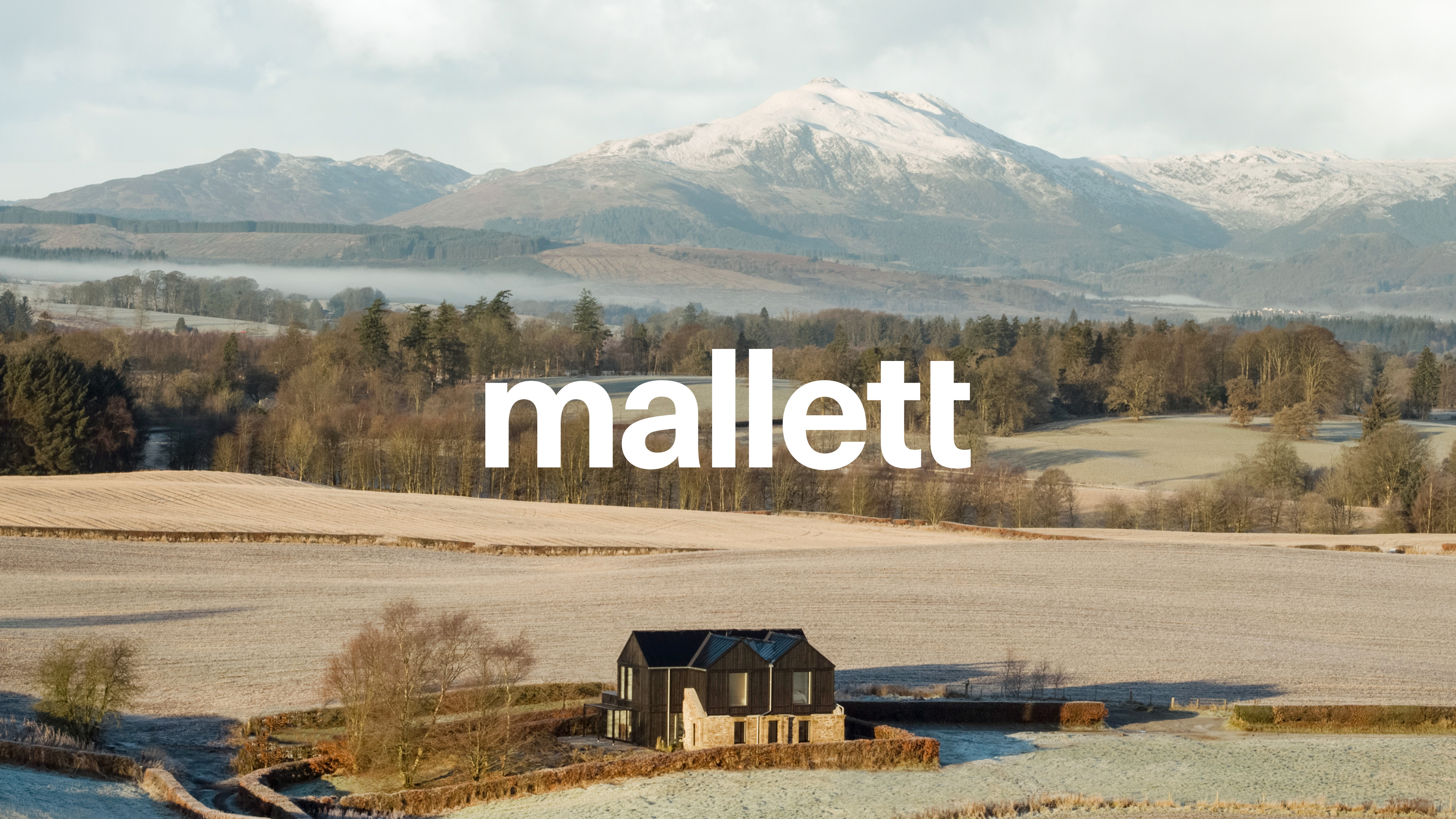
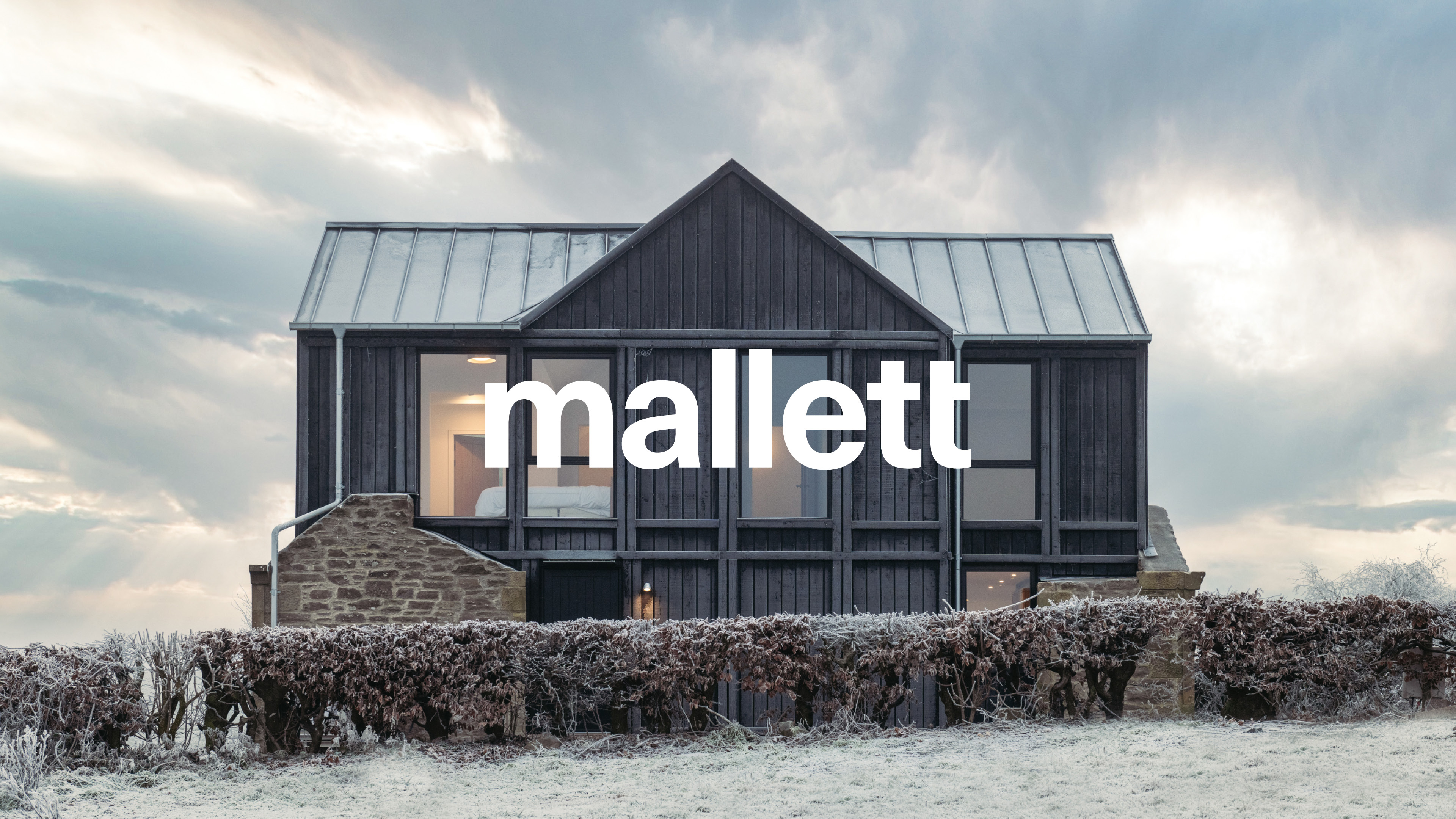
A new brand, website and suite of marketing communications for an ambitious contemporary UK architecture firm.
Mallett approached Agency S/R to elevate their brand, articulate their purpose and develop a visual language that would resonate with their primary audience of design-led, luxury private homeowners.
Our treatment of the identity led to a timeless, modernist aesthetic, one that was equally at home among industrial, urban textures as within rugged, rural landscapes. The brand reflects and amplifies the quality of Mallett’s work, drawing directly from the materials and environments that shape their approach and philosophy.
This subtle yet confident design system was applied across a digital brochure and portfolio website, giving the brand a platform to push the business forward and achieve the critical acclaim it deserves.
/ 003 /
Branding for a modern central London Workspace

Setting a new standard for the contemporary workspace, 127CXR is a brand new office opportunity located in central London.
At Agency S/R we strived to create a destination for this new opportunity - we produced a dynamic name for the destination and a striking logo with a vibrant brand identity. This visual language was developed and applied to a number of supporting marketing materials, on and off-line, that capture the modern, stylish workspaces and facilities required for the urban commuting professional, and the vibrant central hub in which it is located.
The brand utilises a strong, energetic palette that aims to both reflect the spirit of the area and stand out within it. 127CXR is located on the axis of key cultural and transport hot-spots in London, and is the primary inspiration for the graphical language. The use of arrows and crosses, which are derived from the logo type, are utilised in combination to produce striking layouts and compositions. With accompanying characterful typography, this visual language has given us the flexibility to create engaging visual communications for different audiences, and across multiple channels and touch-points.
/ 004 /
A new brochure for a London icon
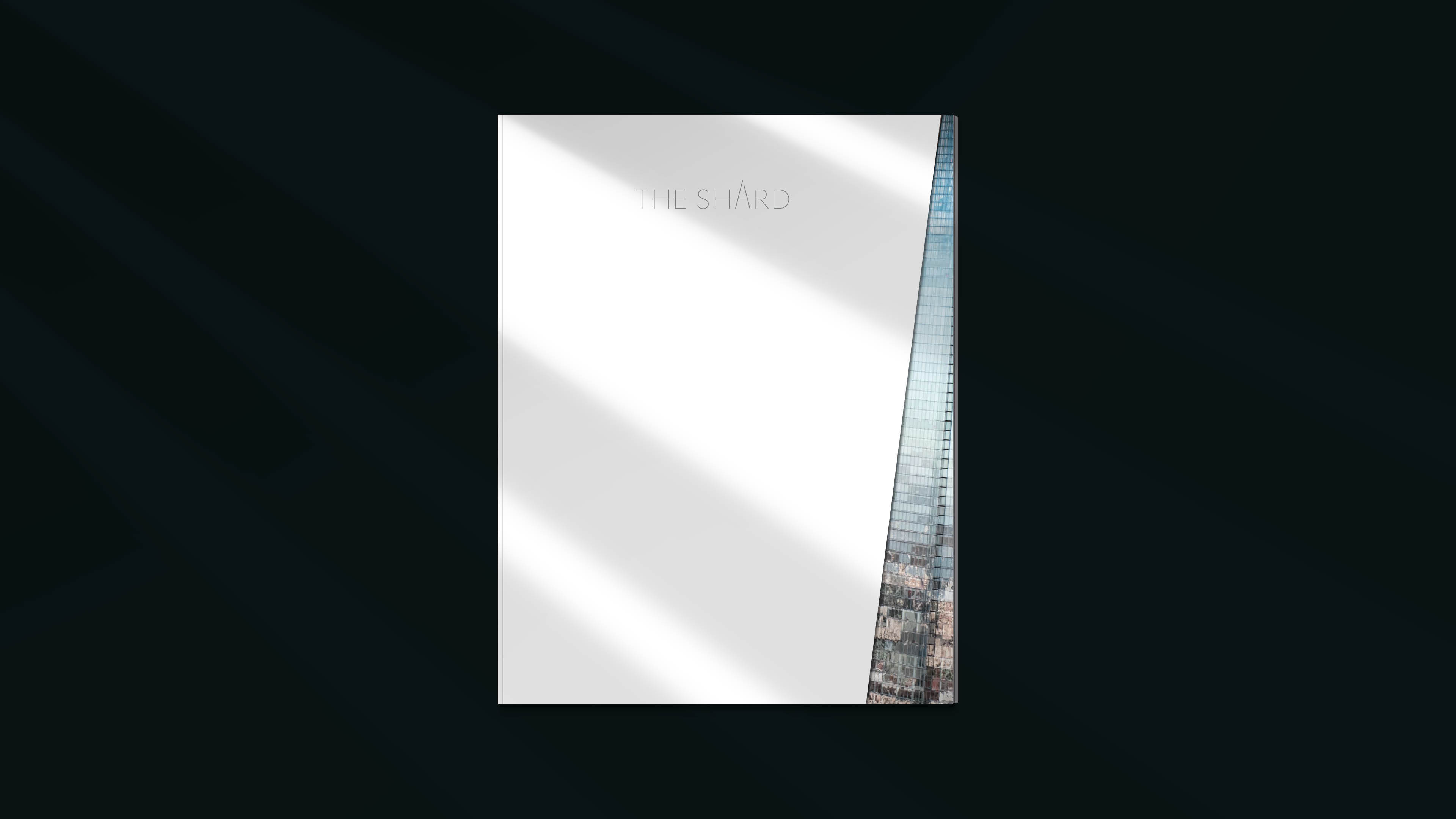
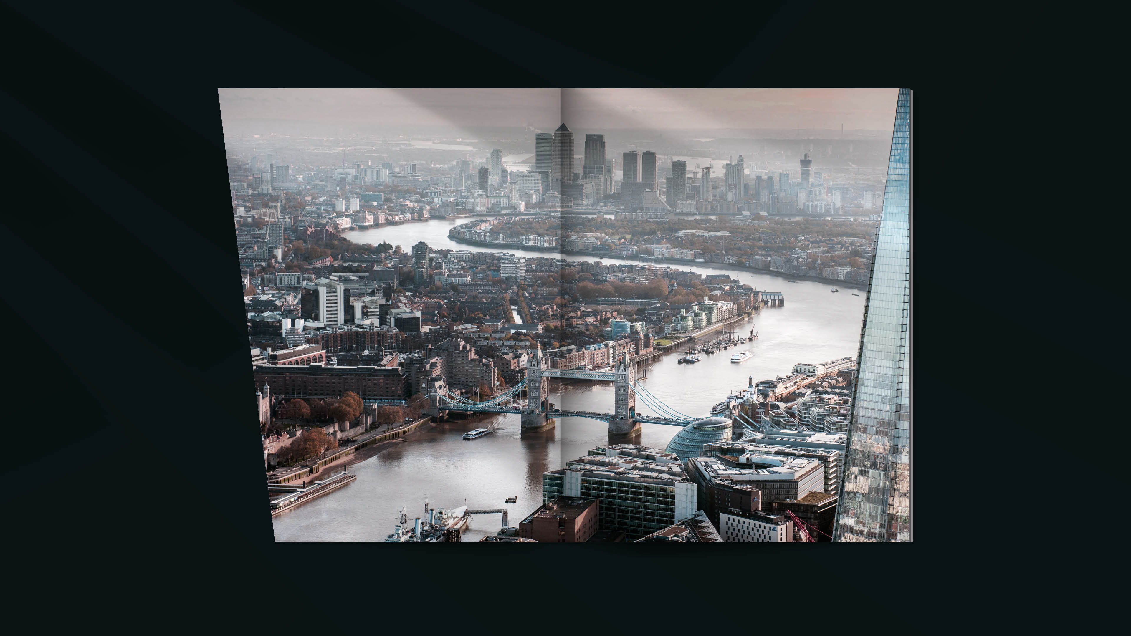
A stunning new marketing brochure for one of the world's most iconic structures.
REM approached Agency S/R to reimagine their printed office marketing brochure, to better engage their audiences. We made it our mission to align the finish and reader experience of this brochure with The Shard's status and reputation as an innovative, forward thinking London icon.
Our approach was to compliment stylish, spacious layouts, with finishes and features that surprise and excite readers whilst enhancing the storytelling of the content. We used a variety of paper stocks, metallic inks, transparent overlays and die-cut pages, to take this reading experience to unexpected places. The design encourages the reader to engage with the brochure on a deeper level, connecting more effectively with the audience and reflecting the originality of this iconic building.
/ 005 /
Bespoke branding and production for a global CMD event
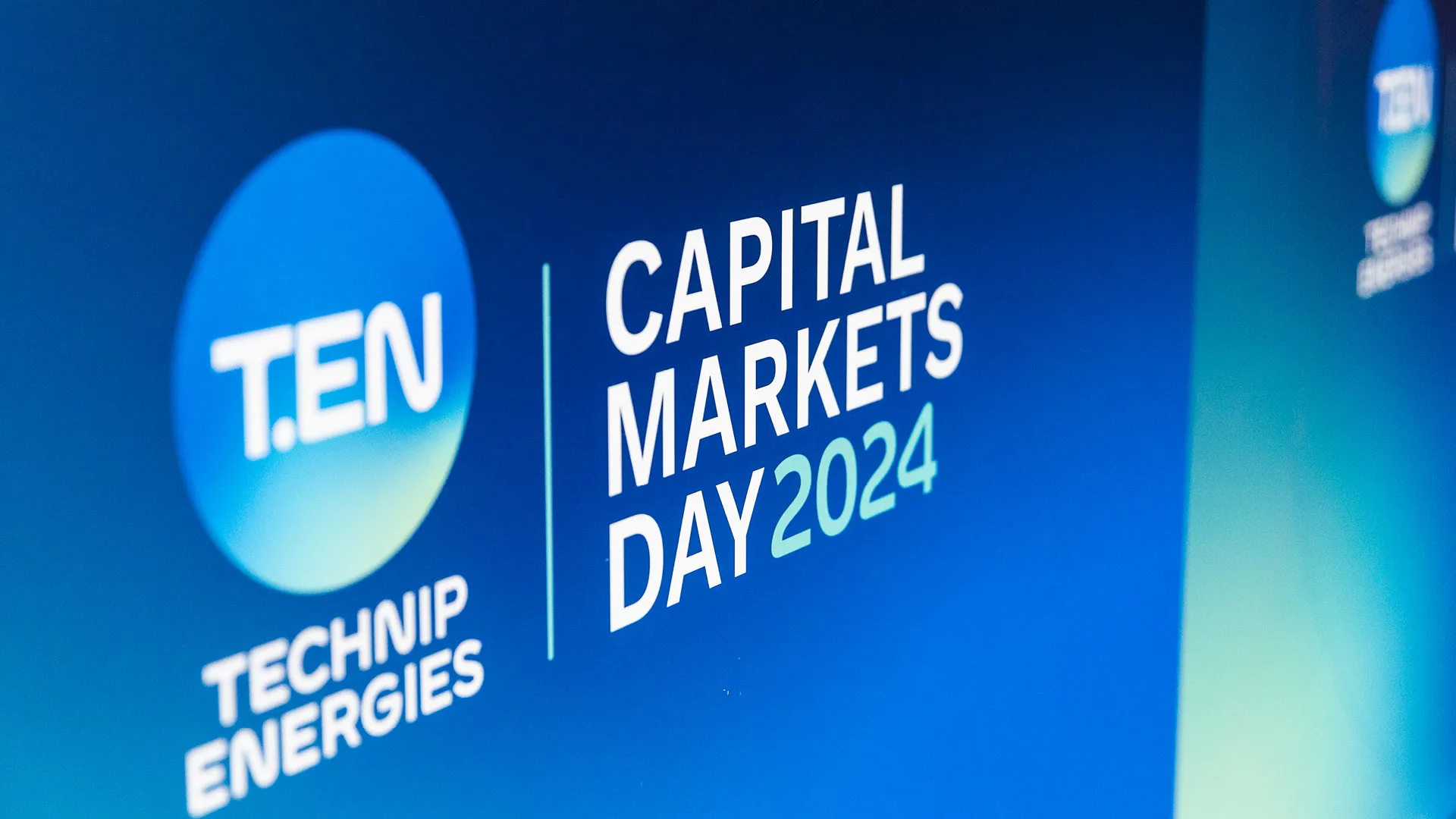
We were initially brought in to redesign the event speakers’ presentations, but our role quickly evolved. As the project progressed, we became a core creative partner, collaborating closely with the branding and senior management teams to shape a distinct identity for the CMD event.
We created a bespoke event logo that merged the primary brand marque with tailored typography (‘Capital Markets Day 2024’) resulting in a refined, flexible asset designed to evolve with future events. To elevate the visual identity further, we developed a sophisticated colour system by blending existing brand colours, resulting in a richer, more dynamic palette unique to the CMD event yet still unmistakably on-brand.
Our involvement spanned every visual touchpoint - digital and print - across the entire lifecycle of the event. From pre-production and on-site setup to live logistics and post-event wrap-up, we were fully embedded in the process. By the end, we weren’t just an agency supplier - we were part of the team, contributing to the creative vision and strategic direction. The result? An unforgettable experience for attendees and the client alike, delivered at the largest event Technip Energies has ever held.
/ 006 /
A brand bible for chart and data systems


Strengthening the brand for one of the worlds' most recognised tech firms, Sonos.
After auditing presentation collateral and several in-depth exploratory meetings with their New York team, we went to work on creating a suite of data design templates to bring consistency and excellent visual storytelling through the use of charts, graphs, iconography, colours systems and written content structure.
The guidelines project was staged in two tiers, the first for internal usage that has an easy-to-understand explanation of what, when and how to use each chart, and a custom library full of PowerPoint templates to allow internal teams to start creating reports that look like they have just come out of a design agency.
The second tier was for the more complex visual storytelling. We developed in-depth guidelines that were to be used to inform partners and creative agencies on how to create visually stunning infographics that would stay true to the Sonos brand. By bringing life and meaning into their graphics using these guidelines, any agency is able to create a beautiful data story through information design.
/ 007 /
An award winning brand campaign for Marylebone


A brand creation and cross-channel marketing campaign for a London residential development.
One Seymour Street is a boutique residential development in Marylebone, by one of the area’s key landowners, The Portman Estate. As their first new-build, residential development, we were brought on-board to advise on the marketing strategy for the development, and to create a name, brand identity and suite of marketing materials to support the off-plan sales activity.
/ 008 /
A fresh new look for a pioneering renewable energy brand

A revitalised brand refresh for the Renewable Energy and Energy Efficiency Partnership (REEEP) to reflect a modern and innovative identity. This update embodies REEEP's core values of innovation, accessibility, and environmental sustainability.
The new logo marque symbolises growth, positivity, and inclusivity, complemented by a professional yet approachable logotype. This logo is versatile and seamlessly integrates with a fresh colour palette that mirrors the environmental focus and dynamic energy of REEEP's innovative work.
The brand's visual language incorporates a combination of serif and sans-serif typefaces in the headline typography, striking a balance between REEEP's serious, knowledge-driven mission and the dynamic, pioneering nature of its initiatives.
/ 009 /
An Estate Agency Website like no other

Every creative worth their salt knows that the right imagery can define the beauty of their design. Which is exactly how we built this website for the property management firm, Domus Nova. An elegant website built for the artistic eye.
To compliment this inspiring photography we designed and developed a beautiful, clean, tranquil multi-lingual site that elevates the perception of what an estate agency website can be. Designed with the discerning buyer in mind, Domus Nova’s overall aesthetic and site functionality will have you reaching for your passport!
/ 010 /
The complex made simple with this Infographic Design Series


The Economist is known for complex topics and detailed research, so our job was to make the complex feel simple yet striking.
With the use of bold colours, high contrast, structured layouts, data visualisations and illustrations we brought an exciting visual narrative to their content. Mainly used online as a long form infographic these simplified the complex, drawing engagement whist delivering knowledge and understanding to the reader.
/ 011 /
A Boutique Residential Marketing Brand


A delicately crafted brand for a Central London development. Venice Court is a boutique residential development situated at the north end of Edgware Road.
Full of activity and buzzing with atmosphere, Venice Court sits in-between the vibrant community and market stalls of Church Street and the tranquil waterways and handsome mansions of Little Venice and St John’s Wood.
Working closely with the client we developed a brand and visual identity for the marketing of the development that took inspiration from the Little Venice, the garden square at the heart of the development and the eclectic nature of the and local community.
As part of the campaign we also collaborated with Westminster College photography students. The brief was to compile a series of photographs that depicted what the are meant to them. The images feature both on the website and within the social media campaign.
/ 012 /
A fresh new Interface for the MeSH home entertainment app


Simple on the surface. Intricately developed underneath.
Ideaworks are consumer electronic specialists, providing custom design, control and installation for homes, super-yachts, developments and hospitality. They provide solutions for lighting, temperature, security, entertainment and more.
Ideaworks approached Surgery & Redcow to re-design the user interface for their product; the MeSh home control. A unique hand-held control giving users the power to control any technology, from blinds and curtains to lighting, temperature AV and more, all from the palm of their hand. The brief was to modernise their interface with a slick, clean design aesthetic and to simplify function to provide and simpler and more intuitive user experience.
This was achieved by shifting the design from a heavily skeuomorphic aesthetic approach to a more minimal, flat design; using flat colour and simple type to quickly and simply communicate functions to users. We retained some skeuomorphs within the UI to help users associate certain controls with their physical counterparts, but applied a clean flat design style to these elements, using colour changes as visual feedback rather than heavy shadows.
/ 013 /
A book of visual storytelling to uncover how to create better and more liveable cities on a global scale

Visual storytelling on a global scale. There’s an expanse of difference between just writing words and numbers, and defining their story through data visualisation. But that expanse was met working with Recoded City on this flagship book.
Recoded City sheds light on a new epoch in the relationship between cities and civil society by presenting an emerging range of collaborative solutions and distributed governance models. The authors draw on their own fresh research of global pioneers forging localist design strategies, public-realm interventions and new stakeholder dynamics. As the world becomes increasingly digital and virtual, a myriad of online tools and technological options are becoming available. These give unprecedented co-creation opportunities to communities and professionals alike, yielding the benefits of a more open – DIY – society.
Because of its close engagement with people, place and local identity, the field of participatory placemaking has huge untapped potential. Responding to the challenges of the Anthropocene era, Recoded City is for decision-makers, developers and practitioners working globally to make better and more liveable cities.
/ 014 /
Designed for luxury. Welcome to 35 Old Queen Street

A contemporary brand steeped in sophistication for London’s luxurious new property development. If you’ve ever wanted to feel like James Bond or Lara Croft, 35 Old Queen Street is certainly the place you’d want to live. An impeccable array of London’s finest homes.
Located adjacent to St James’s Park, 35 Old Queen Street is a late 19th Century building that has been transformed into 16 individually designed apartments. Beautifully crafted and impeccably curated, the development encapsulates both traditional London architecture and bespoke contemporary design. Our brief was to develop a brand and marketing materials that captured the essence of the site's history and location, whilst also re-enforcing the quality of design and finishes on offer.
/ 015 /
Brand creation for a time of crisis


Bringing brand and people together at a time of crisis. Impacting the lives of young people and connecting them with governments on large scale issues. It’s powerful stuff.
Fostering collaboration and to strengthen relationships between young people and local governments, Young Cities is an initiative created by ISD (Institute for Strategic Dialogue) that was developed to address the most pressing issues in their communities, such as hate, polarisation and extremism. It is the first project of its kind to bring together young people and policy makers to address local-level issues on a global scale.
To drive this important initiative we developed a striking brand identity that appealed to both municipal workers and younger audiences, a completely new multi-functional website and a suite of branded materials, including brand guidelines, that were in keeping with the Young Cities vision and philosophy.
/ 016 /
Placemaking for a new vibrant London town


Working with Poly Global, we redefined a quaint London town into the sought-after place to live across a multi-year branding, marketing and sales campaign.
Mill Hill East is a vibrant and affluent London town embarking on great infrastructure change. Poly Global had a vision to create a place their residents could be proud of. We helped them create a compelling story to engage a domestic and international audience.
Launched as The Plaza Collection, the name pays homage to the public square at the foot of the development and drawing on its architectural form, we created an angular brand that represented each house as famous London squares.
/ 017 /
Multi-site website and branding for new care home group


A full branding and large multi-site web project for the new UK care home group, Bracebridge Care Group, an exciting new player in the care home industry.
An adaptable and scaleable digital solution was vital for Bracebridge Care Group to keep up with their rapid growth and expansion to locations across the UK. A wordpress multi-site solution was built to cater to two separate needs. Firstly, A primary company website – a hub of information for the care group as a whole entity, equipped with location search and general company information. Secondly, a larger multi-site environment, enabling the client to produce a templated website for each individual care home as they need, scaling their online presence as their business grows.
A flexible brand was required to both cater for the need for a master brand for the care group and for each individual current and future care home. It was of the utmost importance to our client that people - their residents - were at the heart of the Bracebridge brand and that inclusivity and individuality were celebrated. The brand visual language and tone of voice has been crafted to effectively communicate the quality of the facilities and the professional care, whilst also feeling accessible, warm and welcoming.
/ 018 /
A new brand for a better future

A vibrant brand for an exciting new initiative aiming to provide 3 million Africans with access to clean cooking solutions.
It's not often you get asked to create a brand for a good cause, so when Nefco approached us to develop the entire brand suite for Modern Cooking Facilities in Africa we were thrilled to be part of this exciting new initiative.
The first step for us was to meet with the client in a brand workshop and learn as much as we could about the project goals, aspirations and overall vision. This gave us understanding an insight on how we were going to position the MCFA brand that would allow us to give visibility to a new life changing project.
Based on clean energy, entrepreneurship, climate & environment and gender equality, we developed a clean, bold and modern brand that stands out in the market and will help facilitate improving health and climate by reducing indoor air pollution, avoiding CO2 emissions and mitigating deforestation. Our thanks go out to Nefco for choosing us to create a new brand for a better future!
/ 019 /
An Idyllic modern residential development brand


A brand with vigour and verve. Working with Peabody, the Arden development was a landmark regeneration project in SE10, so we needed our brand to pack a punch!
Arden at Parkside SE10 is the final phase of a landmark regeneration project based in South-East London that has spanned nearly a decade.
Working closely with the client we developed a brand and visual identity that took direct inspiration from its location, surrounding areas and local community. Perfectly placed right at the centre of vibrant Lewisham, historic Greenwich, and the vast verdant open-spaces of Blackheath; Arden is an idyllic modern residential development that had a unique and distinct personality.
As part of the wider sales and marketing campaign, we also created a multi-lingual local lifestyle brochure, floor plan brochures, general factsheets and investor guides, as well as a variety of print and digital media and OOH advertising. We also collaborated with local people and businesses, including a Lewisham based artist who created three bespoke paintings inspired by Arden and the area, which we also used as the main brochure’s dust-jackets for an added layer of community collaboration and distinct design.